I started off making websites with a goal of fun and entertainment, looking for a way to expose my ideas to the world. With this goal, I started working hard on my websites making them colorful and good looking. This may have paid off for the artistic look, but I wasn't making any money from the ads that I posted on my website through Google Adsense, Linkshare, Commission Junction, and other affiliate programs. My site began to take on a form of its own, and the ads were placed where I could fit them in.
Then one day it hit me. "Why isn't there social scientists who study colors and ad placement on the internet, and if there were, could they give me advice on fixing up my site to get more clicks and make more money from my site. So I did some research on the best placement for ads on a webpage and blog and here's the first tip I discovered:
AD PLACEMENT IS KEY
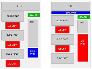
The Grey area is where your content goes. The Red area is the optimal Ad Unit placement area. The Blue regions are where you place Ad Link Units (*Not the same as ads). The Green area is where you should put a Google Searchbox.
Adsense provides 3 main ways to make money:
1. Ad Unit - When someone clicks, you make money (Can use up to 3 per page)
2. Ad Link units - A click sends the web surfer to a page of relevant ads, where they must click an ad to make you money. (Can use up to 3 per page)
3. Google Searchbox - The searcher can search up to 3 websites of your choosing, as well as Google, if they click on a Google Ad, you get paid. (Can use up to 2 per page)
When using Ad Units, the most successful click-through rate has been found to be with:
1. 336 x 280 --BEST AD UNIT TO USE BY FAR
2. 300 x 250
3. 728 x 90 Leaderboard
Google Ad Placement Tps
1. Be sure to make your ads look like content.
2. Place ads in content, not around it.
3. Don't hide your ads, fearful that the consumer will leave your site. Good ad placement will actually bring more content to your page, increasing the chance of a return visit.
4. Choose the proper color scheme.
Best color scheme to increase Adsense revenue:
Border = #ffffff (No Border is best)
Link = #0000ff (Blue - Classic Link color for good reason, people want to click here)
Description = #000000 (Black - Easiest Color to read, think newspaper, books, etc)
URL = #666666 (Grey - Color will be practically ignored)
Friday, January 18, 2008
Make Money with a Blog and Google Adsense - The Best Template & Colors to use
Posted by
Unknown
at
2:14 PM
![]()
Labels: best ad placement, blog colors, Blogger, Google Adsense, making dollars, most successful ads, online income, optimize website, website revenue
Subscribe to:
Post Comments (Atom)


No comments:
Post a Comment